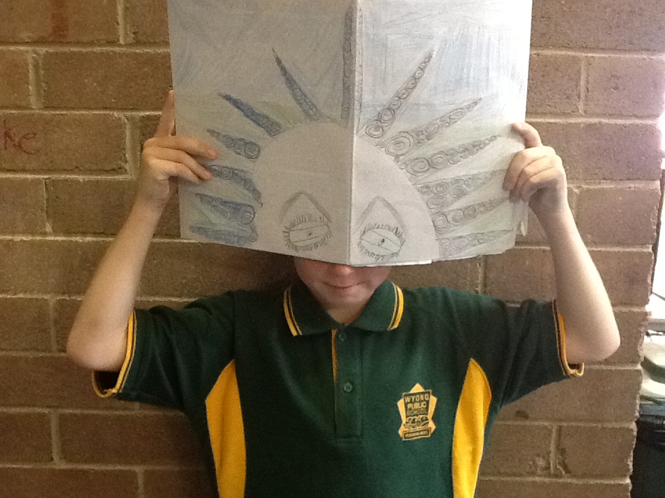
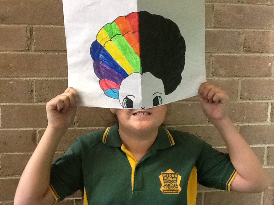
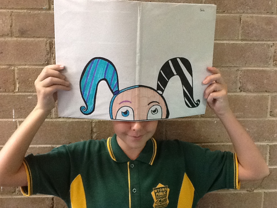
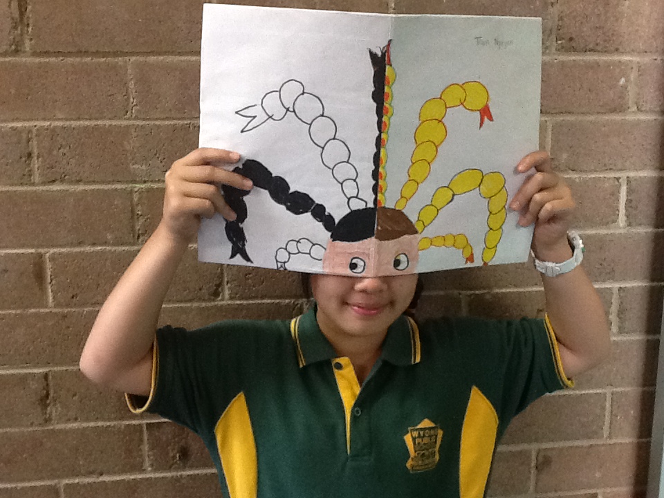
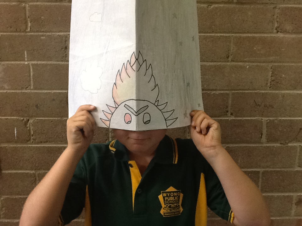
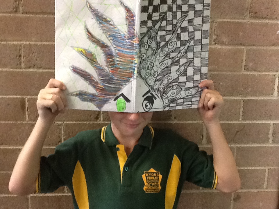
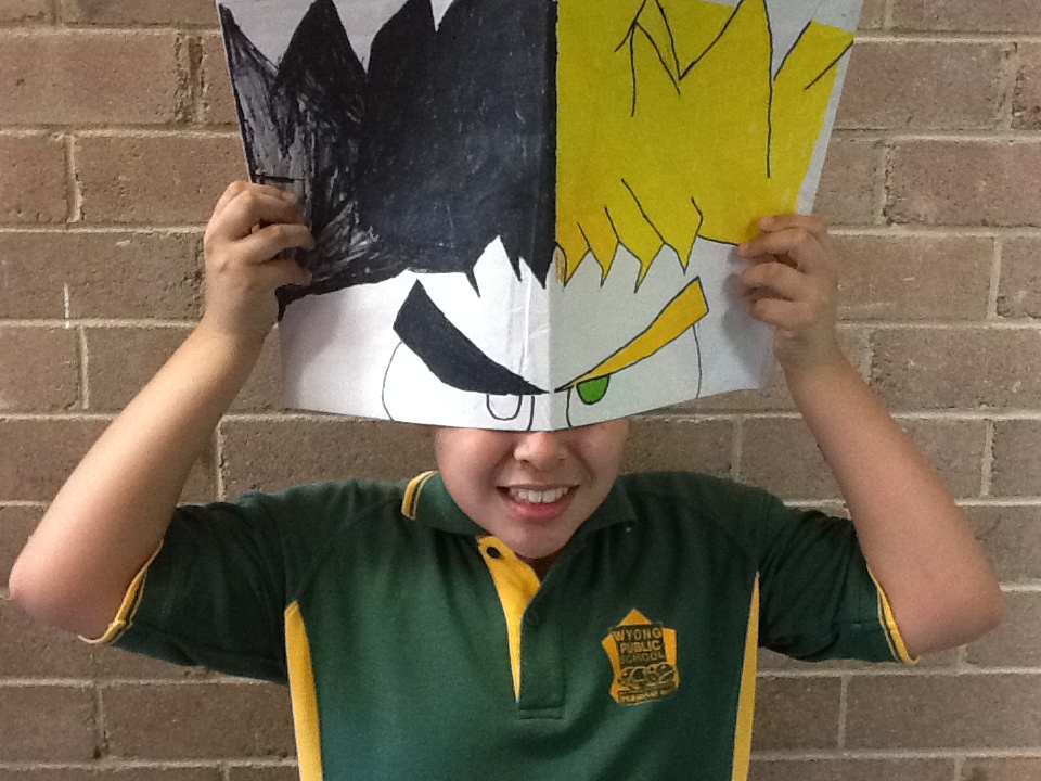
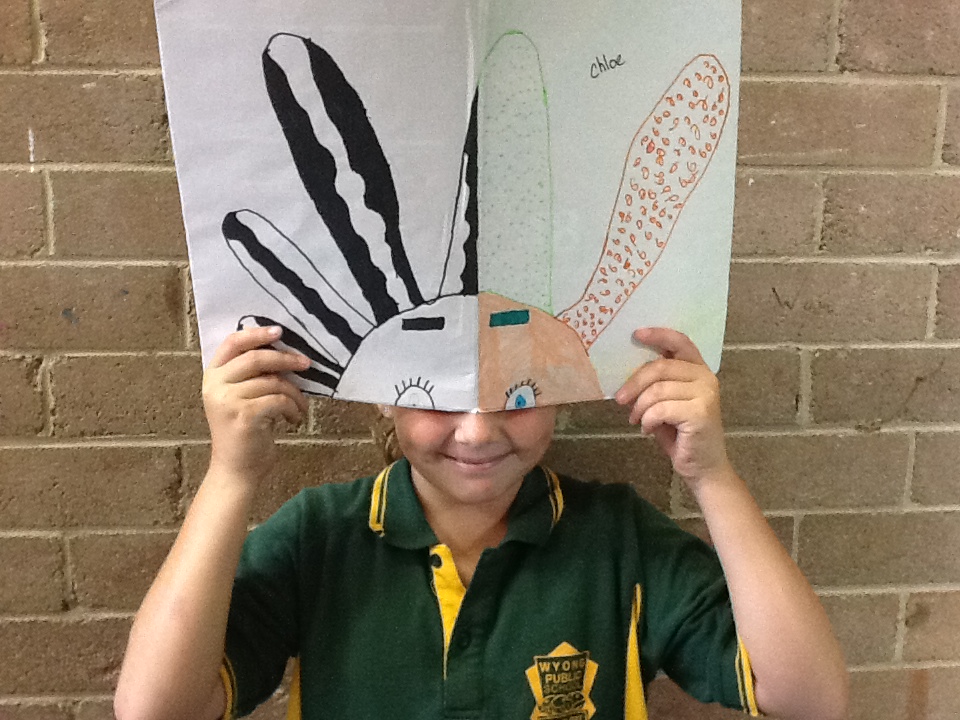
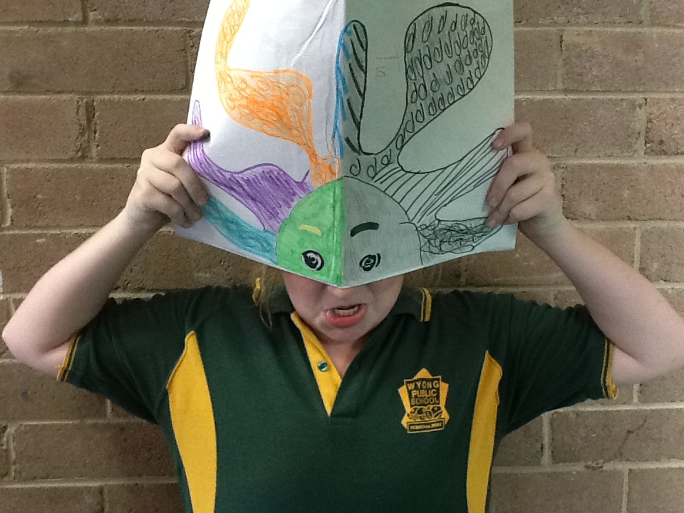
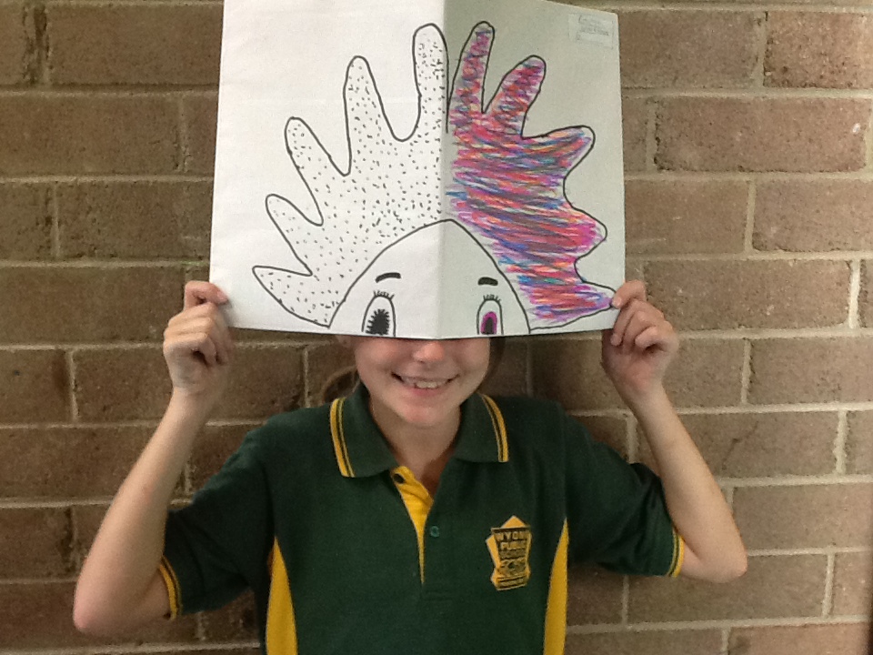
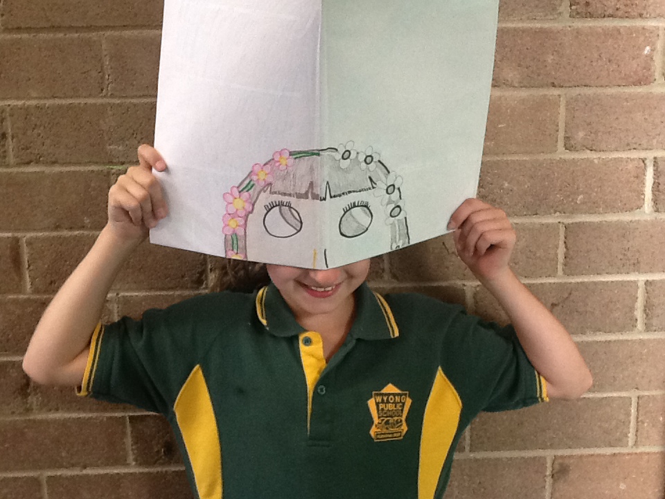
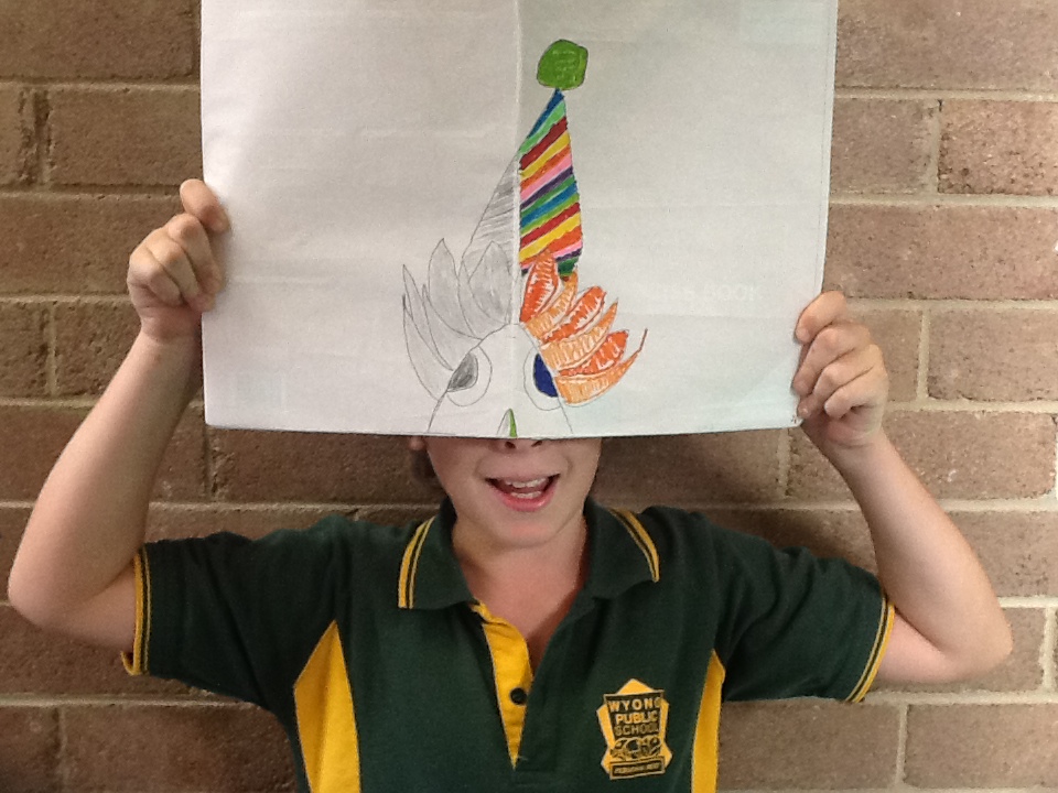
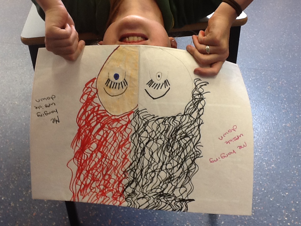
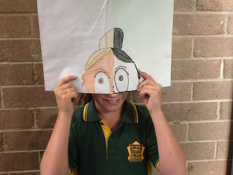
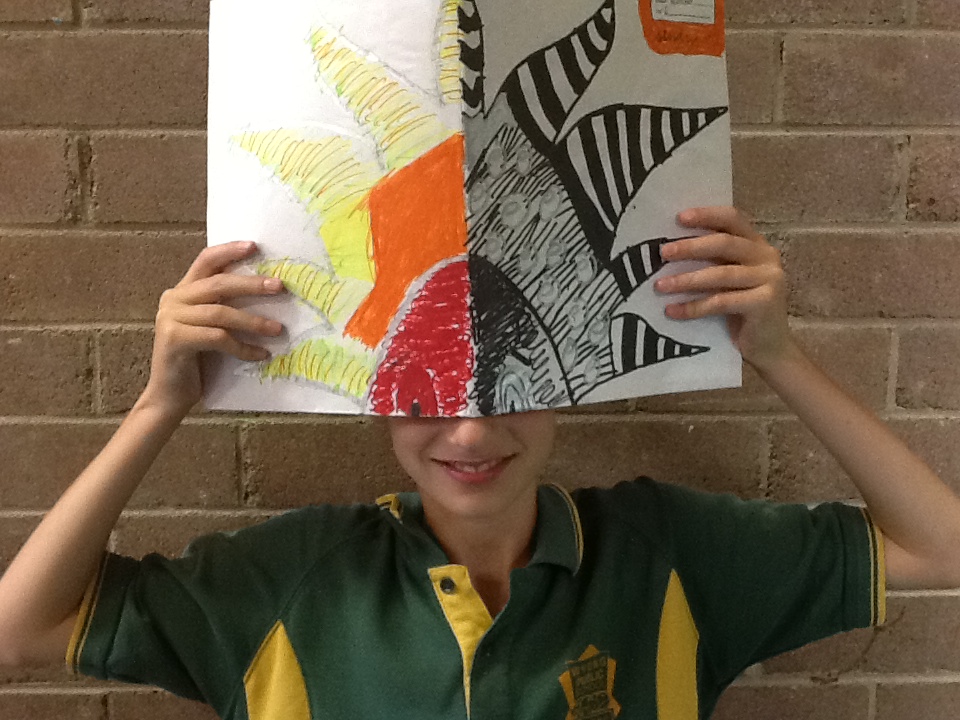
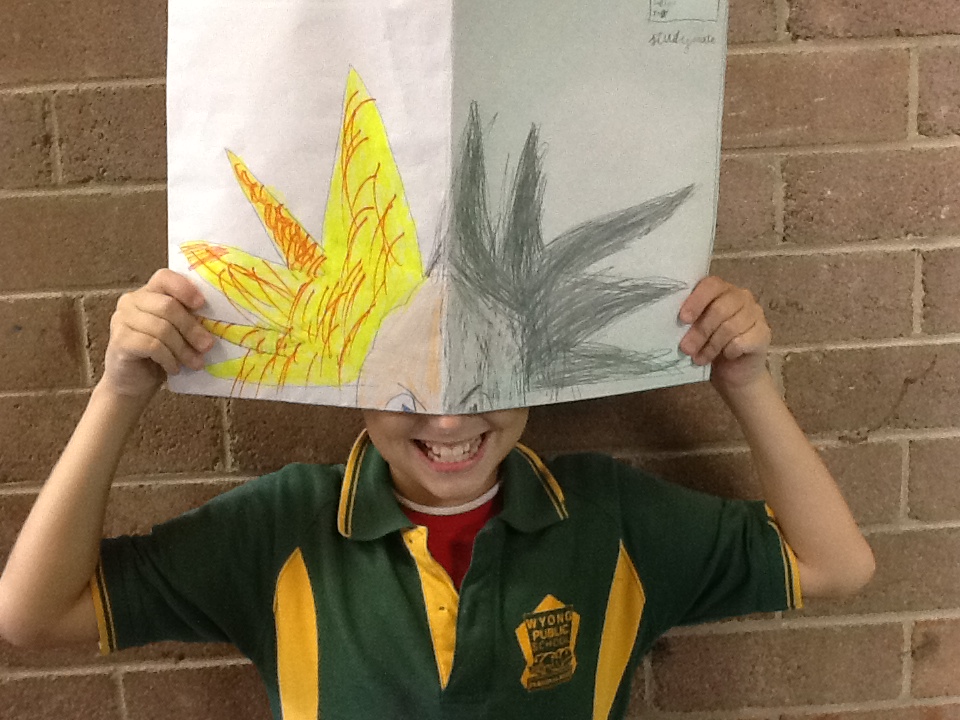
At the end of Term 2, we designed some new covers for E.B White's classic 'Charlotte's Web, which we have studied throughout the term.
We were quite fascinated by the effect that different colours, character positioning and cover compositions have on the 'feel' of a book cover and the influence that it might have on the person about to pick up the book! Some of our covers communicated 'warm, fuzzy children's novel about a sweet piggy' whereas others conveyed Fern's fear about Wilbur being harmed. Publishers must choose carefully if they want to sell books to the right audience!
Great designing S23K, some potential graphic designers in the making.


 RSS Feed
